
Sailing the Blue Skies since 2001.

Video game box art could be considered akin to the cover of a book, but I think that it's an important aspect of a game's design principles, especially today. You can get so much out of what thoughts, planning and development concepts a game has taken just by a brief glance at a cover. I've taken a few of my favorites from an array of systems, as well as some of the worst examples I've seen, and now present them in as a special feature. I plan to do a few more of these down the road on the blog. ^_^
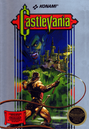
Castlevania (NES, Konami)
Much of the NES box art was heinous (makes me wonder how Mega Man became such a huge franchise at times), but Konami managed to put out some of the best for the system, and Castlevania is a prime example. The artist managed to capture the essence of the game's concept effortlessly. The series would continue to provide some of the greatest box arts in gaming's history (as well as a few duds, like Dawn of Sorrow, the Castlevania Adventure and Dracula X SNES).
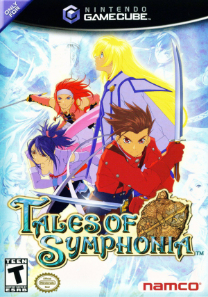
Tales of Symphonia (GC, Namco)
I love the character designs for Tales. I bought an import art book, so that ought to showcase my passion. But it began when I saw this art (with a slightly different background) on a Nintendo Power issue. I liked the variety of colors used, the poses drawn, and thought the designs were fairly unique at the time. Looking back on this art reminds me of how much I enjoyed this game.
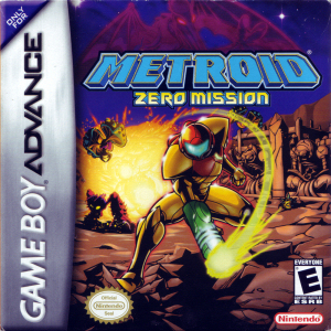
Metroid Zero Mission (GBA, Nintendo)
Metroid has always had strong character/monster design (the original Metroid was a touch iffy, but some of it is still pretty neat), and I think that the cover for Zero Mission is the best example of it. Samus takes central stage as usual, but here she's actually doing something (most Metroid covers have her standing still or pointing her Beam at something, but remains remarkably static). The art style is more anime-esque than usual, which works with Metroid pretty well (although I must admit to adoring the concept works Retro's done in a more realistic style) in my opinion, and, as I said with Castlevania above, it gets the gist of what the series is about and presents it well.
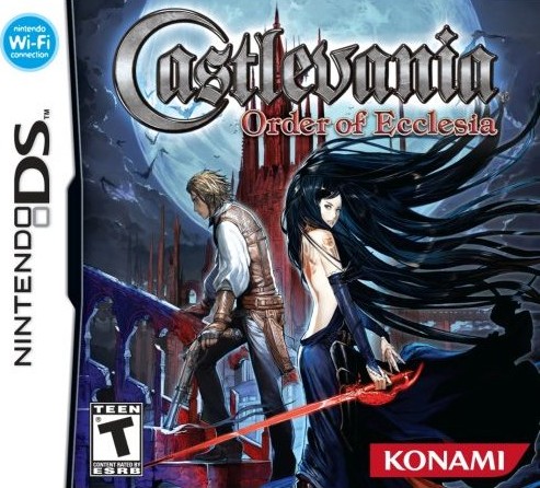
Castlevania: Order of Ecclesia (DS, Konami)
I seem to be referencing that Castlevania box art a lot. XD This art blows me away. When you consider IGA's odd decision to force the Castlevania art style into an uncomfortable anime gloss that failed to do it justice for two games, seeing the glorious return to the dark, moody and gothic goodness the series has prided itself on was a treat and a half. While not as feminine as Ayumi Kojima's work, Konami's new artist took their own unique stab at the franchise, producing a look that fits the mold and then some. I really hope that this (and not Castlevania Judgment, which again relied on bizarre anime designs) influences the series' future.
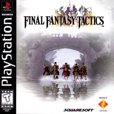
Final Fantasy Tactics (PS1, Square)
We can be honest here. A lot of the early attempts at 3D are pretty unimpressive now. I can say though that Square's cover for FFT overcomes that obstacle with a very cool idea. The setting here inspires a heroic "Magnificent Seven" vibe with the Chocobo riders riding in under a bridge, which I think comes across as eye-catching. Out of all the Final Fantasy games (and my, there's been a lot), I think this is the best one Square's come up with.
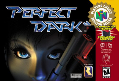
Perfect Dark (N64, Rare)
Some may disagree, but I have always found Perfect Dark's cover to be awesome. Using darkness (hey, how fitting!), light effects, shading and some nifty reflective effects on Joanna's eyes, you can get a good idea of what PD is about really quick. It's got guns, aliens, and a lead heroine all mixed up with a dark overtone, which sums up the storyline nicely. One of the better N64 covers.
And now, onto some of some of the worst...
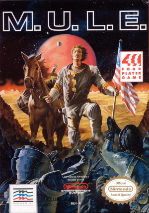
M.U.L.E. (NES, Mindscape)
Man, oh man. While the original M.U.L.E. had a weird box art as well (which I like, but it's a matter of opinion), this one manages to be bad in many, many ways. For one, America was not even mentioned in the original, so why is our bold oxygen-rejecting humanoid holding their flag? Flags as well serve no purpose in M.U.L.E. I'm not sure what our alien worshippers are doing at the bottom...praying to our studly American sex symbol? And lastly, the game's called M.U.L.E. They're robotic, and they look like mules. So why is our sex god leading a REAL HORSE? Oy.
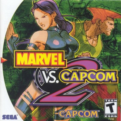
Marvel Vs. Capcom 2 (DC, Capcom)
Capcom had a nasty habit of releasing some fighting games with some very unappealing covers. I like CRMK's MvC2 designs, sure, but why did we not use the cool collective character art hiding in the background as the main focus? Did Capcom fail to realize that Guile's head is looking down at Guile's other head in a scolding, grumpy tone? (It's almost the only character you can make out in the back, outside of Hulk on the left). But, this is not as bad as...
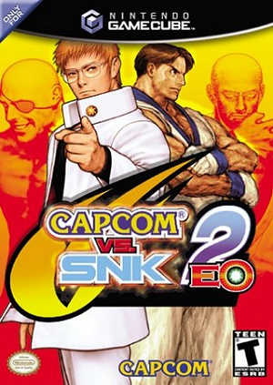
Capcom Vs. SNK 2 EO (GC, Capcom)
This...which is lazier still. It took me years to realize that that is Geese behind Kim (I've been looking for that hobo-looking guy on the roster all this time!). And, as much as I like Sagat, Kyosuke, Kim and maybe-Geese, I'd think that throwing out Ryu, Terry, Chun-Li and Mai would have been a better thought for this route. Or, perhaps, one of these instead:
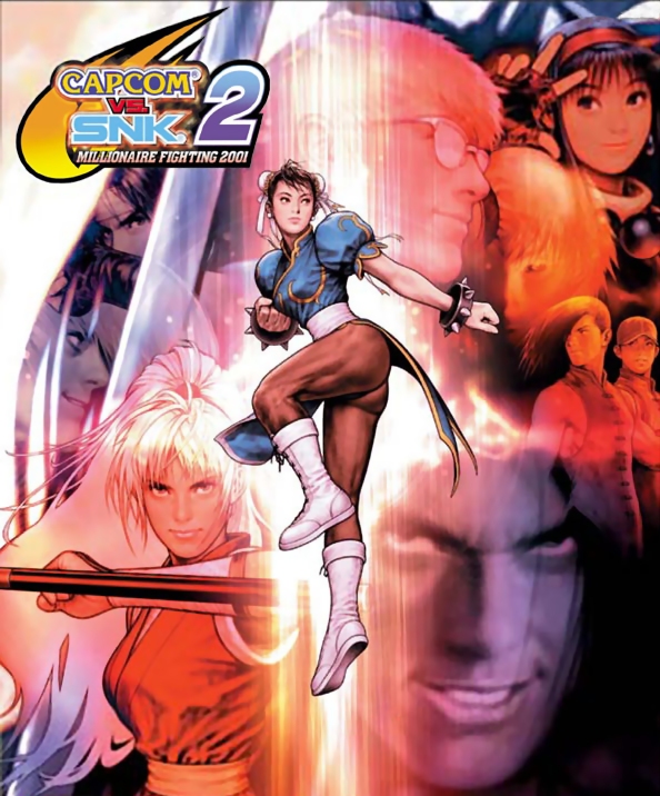
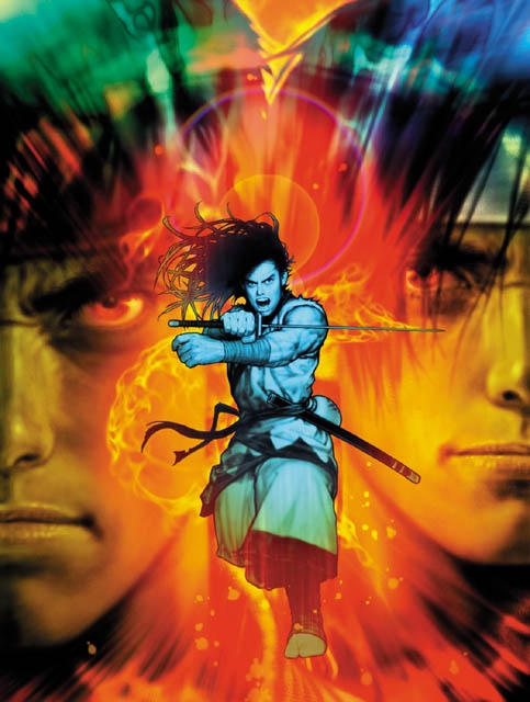
Both at least look much more like cover art potentials than what Capcom actually used...in my mind, anyway. That's all for this time!